
Tokens

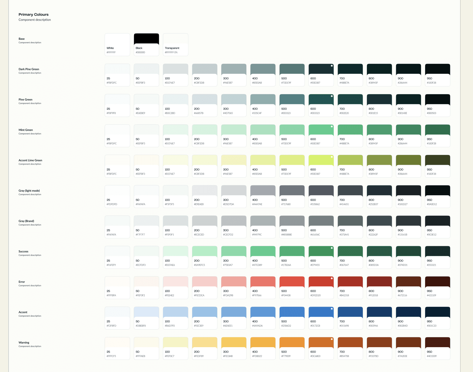
Colours
Typography

Icons

Spacing & Radius

Buttons

Input Field

Badge

Dropdown

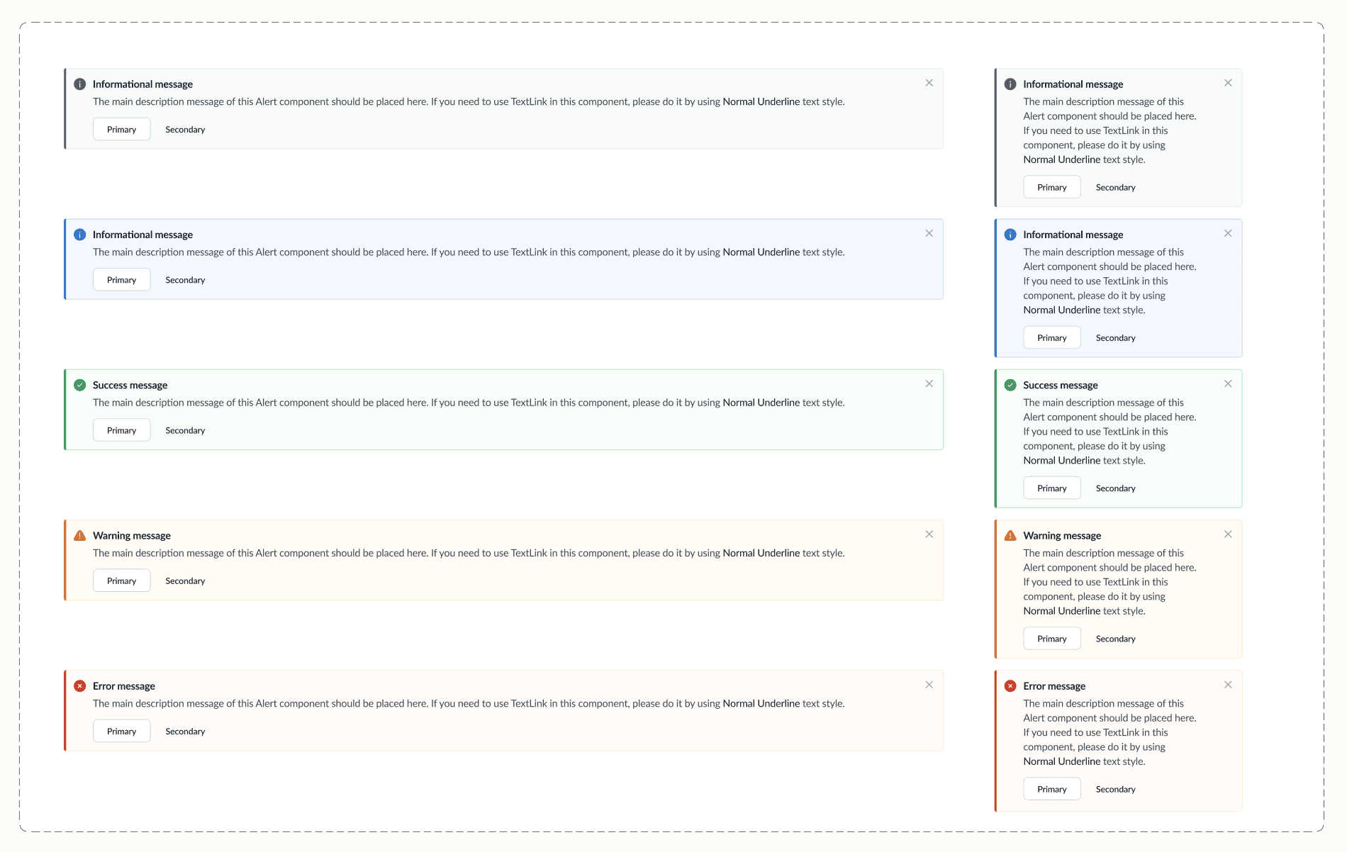
Alerts
Building PL Prepaid Design System
Creating a scalable, token-driven design system for a fintech prepaid card product — from audit to platform adoption.
Company
Pine Labs
Role
Senior UX Designer
2025 - 2026
Scope
Design System · Component Architecture · Documentation · Design–Engineering Collaboration
Overview
Background
Pine Labs Prepaid is a comprehensive prepaid and consumer engagement ecosystem for businesses. It offers solutions spanning gift cards and prepaid programs, loyalty and rewards, digital wallets, marketplaces, B2C platforms such as Woohoo, and commute solutions such as Bharat Yatra. Together, these products help businesses manage stored value, rewards, distribution, and consumer experiences across online and offline channels.
System Scope
A complete token-driven design system for Pine Labs’ prepaid product — covering colour architecture, typography, spacing, elevation, and 18 component families from buttons to data tables. Every element is accessibility-tested, documented, and production-ready.
Component Categories Designed & Coded
Buttons
Dropdowns
Toggles
Avatars
Alerts
Notifications
Tabs
Tables
Empty States
Chips
Input Fields
Checkbox & Radio
Tooltips
Tags
Toast
Badges
Button Groups
Pagination
Breadcrumbs
Modals
18
Component Families
160+
Design Tokens
300+
Variant Configurations
98%
WCAG AA Compliance
6 mo
Zero to Production
Discovery
Visual Fragmentation over 5 Years
With 3 decentralized product design teams shipping features independently, the core experience fractured. Designers spent time reinventing layouts, and engineers spent up to 40% of their sprints custom-styling components like dropdowns and action buttons from scratch.
Friction metrics identified:
47
Button styles shipped
12
Shades of Brand Green
40%
Developer sprint waste
“We use separate open-source libraries across different products, so we don’t have a single master library. Components are built as requested for each project.”
— Engineering Lead
“Visual inconsistency in our product pages is eroding user trust. Users ask if they are two different sites.”
— Product Manager
Competitive Benchmarking Grid
Polaris (Shopify)
Excellent merchants data layout; inspired our density tokens.
Carbon (IBM)
Highly structured state naming; inspired our token naming system.
Material Design
Too generic for fintech, but helped establish our Android layout grids.
Lightning (Salesforce)
Heavy enterprise logic; helped shape our filtering systems.
Process & Planning
Atomic Build Order
We prioritized components by frequency of use and dependency chain - building the most reused, least dependent pieces first.
Primitives
Month 1-2
Buttons (5 hierarchies × 5 sizes × 4 states), Checkbox/Radio, Toggle switches.
Form Controls
Month 2-3
Input fields (text, textarea, verification code), Dropdowns (standard, filter, input dropdown with search).
Feedback
Month 3-4
Alerts (4 types), Toast notifications, Notification banners, Badges, Tags/Chips.
Navigation
Month 4-5
Tabs, Breadcrumbs, Pagination, Button groups.
Complex Patterns
Month 5-6
Tables (with sort, frozen headers), Modals, Empty states, Avatars, Tooltips.
Library Stats
Component families
18
Variant configurations
300+
Months to production
6
COLOUR MODES
2
Token Architecture
Separating Value from Intent
Instead of hardcoding colors, we built a 2-tier token hierarchy. This decoupled basic CSS values from functional design intent. When brand colors change, updates take seconds, not sprints.
2-Tier Hierarchy Spec
1. Primitives (Values)
Raw value definitions
pinegreen-600: #005656
accent-600: #0172CB
2. Semantic Aliases (Intent)
Role & usage definition
color.foreground.primary
color.text.link
Components
TOO RIGID
Forced everything into strict nested structures. Designers bypassed the library because it stifled creative exploration on specific layout options.
TOO FLEXIBLE
Detached and broken buttons returned. Designers had too much freedom to overwrite sizes and styles, leading back to visual fragmentation.
THE SWEET SPOT
Established clear constraints. Strict spacing and global colors, but with customizable slot areas for flexible layout exploration.
Internal Alignment and Objections Overcome
Cultural Frictions
• Color naming wars: Spent 3 weeks aligning engineering and design on a semantic palette naming convention.
• Dropdown disaster: Component was too complex, requiring 6 nested sub-components and 3 redesigns.
• Spacing theology: Deep arguments over whether 4px base grids are more flexible than 8px.
Testing
Visual regression testing
Chromatic snapshots on every PR, catching unintended style drift instantly across themes and component state changes.
Accessibility audit
WCAG 2.1 AA compliance — contrast ratios, focus rings, keyboard navigation, and screen reader labels verified programmatically and manually.
Cross-browser validation
Verified across Chrome, Safari, Firefox, and Edge on desktop; optimized for iOS Safari and Android Chrome on web targets.
Developer usability testing
5 engineers completed product screens solely using DS components to measure first-time developer ergonomics and build speeds.
Usability & Coverage Metrics
98%
WCAG AA Compliance across core atoms
0
Visual regressions shipped in 4 months
67%
Faster dev build speed in sandboxed testing
Governance
Core Design System Team
2 dedicated designers and 1 frontend steward who maintain, update, and manage global tokens, base components, and official documentation.
Ecosystem Contributors
Product designers across vertical squads who submit changes, propose net-new components, or optimize variants using the official RFC template.
System Consumers
Everyone else inside product lines. Consumers rely on published nodes, import packages natively, and report production edge-cases.
07 / DOCUMENTATION & ADOPTION
Documentation & Hand-off
Interactive Anatomy
Labeled component blueprints explicitly explaining slot layouts.
Documented padding, spacer dimensions, and token mapping rules.
Design guidelines illustrating both active and focus states.
Usage Guidelines
Explicit ‘Do vs Don’t’ interactive examples showing spacing constraints.
Guidelines indicating when to opt for specific visual variants.
Standard placement rules on mobile viewports and dialog popups.
Props & Variants
Storybook mappings aligning Figma component names to code endpoints.
Detailed props tabular list including types, defaults, and usage contexts.
Integrated design-to-code testing with automated Playground widgets.
Business Adoption Impact
78%
Adoption within 6 months
-52%
Reduced design-to-dev handoff delay
-34%
Reduction in core UI bug tickets
Learnings
01
Start with tokens, not components.
Tokens are the DNA. Components are the organs. Get your base design-to-code properties mapped cleanly first, and components will practically form themselves.
02
Sell the system to engineers first.
Figma updates please designers, but clean code adoption saves actual sprint money. Find engineering advocates early.
03
Perfect is the enemy of shipped.
Our first release was incomplete, but shipping early sparked the direct cross-team discussions we needed to iron out structural issues.
04
Name things for intent, not appearance.
Using ‘comp.button.primary.fill’ is completely robust. Hardcoding colors like ‘mint-400’ directly breaks on the first brand overhaul.
05
Document the why, not just the what.
Anatomy drawings are helpful, but the rationales detailing usage contexts are what actually helped developers implement design patterns.