
Gift Card Marketplace
Redesigning Pine Labs' white-label gift card platform to enable instant, modular client deployments for major banks, fintechs, and high-volume consumer platforms.
Company
Pine Labs Prepaid
Role
Senior UX Designer
2 Months (End to End)
Platform
Mobile & Desktop
(Responsive)
Team
2 Designers · 2 Product Managers · 10+ Engineers · Business
01
Overview
What is Gift Card Marketplace?
A fully managed, white-label gift card marketplace platform built by Pine Labs (Woohoo) that empowers banks, fintechs, and consumer platforms to launch their own branded gift card stores — with zero operational overhead. Partners plug in, customize with their brand, and start selling gift cards from 50+ top brands to their existing user base.
Trusted by leading financial institutions & platforms
Axis Bank
HDFC Bank
IndusInd Bank
Alliance Bank
Bajaj Finserv
Simpl
…and more
My Responsibilities
User Research
Information Architecture
Wireframing
Visual Design
Prototyping
Design System
Developer Handoff
₹4 Cr+
Net Operating Revenue Impact
6+
Live Client Deployments
50+
Premium Brands in Catalogue
02
Challenge
When I joined the project, the legacy platform was structurally functional but severely underperforming on high-value digital metrics. Enterprise onboarding was slow, and conversion ratios suffered due to heavy UI layouts squeezed awkwardly inside nested partner app containers.
Three Primary Revenue Streams
One-Time Setup Fee
Each new enterprise client pays an upfront system integration fee for Pine Labs to configure and deploy their custom, branded white-label marketplace.
Distribution Margin
For every gift card sold to consumers, Pine Labs captures the spread between wholesale brand acquisition rates and the customer-facing purchase price.
Processing Fee
Per-transaction technology clearing fee applied to top-tier brands currently integrated into Pine Labs’ robust regional processing API.
03
Understanding the Problem
The existing legacy marketplace suffered from severe conversion drop-offs, completely non-customizable branding (often requiring engineers to manually hardcode styles for each bank), and a cluttered desktop-first UX layout.
Four Key Architectural Pain Points
Cluttered Home Screen
Competing banner carousels, dense brand logos, and a confusing triple-path search layout (Occasions vs. Categories vs. Recipient) paralyzed users. Discovery was slow and frustrating.
No White-label Flexibility
Manual CSS overrides for every client deployment. Lack of a unified layout grid meant slow, multi-week onboarding times for major banks like HDFC.
Complex Purchase Flow
The Product Detail Page (PDP) suffered from extreme cognitive load. Delivery inputs, value calculators, terms, and cross-sells fought for the same fold.
Poor Mobile-first Experience
Historically built for desktop web, then squeezed into mobile web-views inside banking apps. Clunky persistent headers and hidden nested navigation ruined mobile conversions.
Interface Audit (Legacy Application)

72%
Conversion Drop-off at Product Page
4.2m
Average Time to Complete Gift Purchase
35%
Support Tickets due to Navigation Chaos
04
Process & Approach
We focused on a clean, scalable design system framework. We rebuilt the core user flows, optimized the purchase friction, and introduced a smart white-label customization token architecture.
E2E Redesign Timeline
1
Research
2
IA Overhaul
3
Wireframing
4
Visual System
5
Prototype
6
A/B Testing
7
Handoff
Key Design Decisions
01
Category-First Browsing
We introduced a highly visual category grid (Fashion, Luxury, Food, Grocery, Travel) showcasing dynamic active discount tags, instantly capturing direct buyer intent.
02
Savings-Forward PDP
We elevated a smart interactive savings calculator on the PDP above the fold. Instantly demonstrates net effective price to motivate bulk corporate orders.
03
White-Label Design Tokens
We built a modular variables framework. Clients need to supply only 4 base tokens (primary brand, accent, logo, favicon) to render custom theme platforms instantly.
05
Before & After
A side-by-side look at how we reimagined every touchpoint of the gift card marketplace — from cluttered and inconsistent to clean, conversion-optimized, and scalable.
01. Mobile Home Screen
BEFORE
Old Home

AFTER
New Home

↑
40% engagement with category grid
↓
3 taps to purchase (from 7)
↑
2x time on page
02. Product Detail Page (PDP)
BEFORE
Old PDP

AFTER
New PDP

↑
45% conversion rate
↓
50% scroll depth to purchase
↑
3x savings calculator interaction
03. Desktop Experience
BEFORE
Old Desktop

AFTER
New Desktop
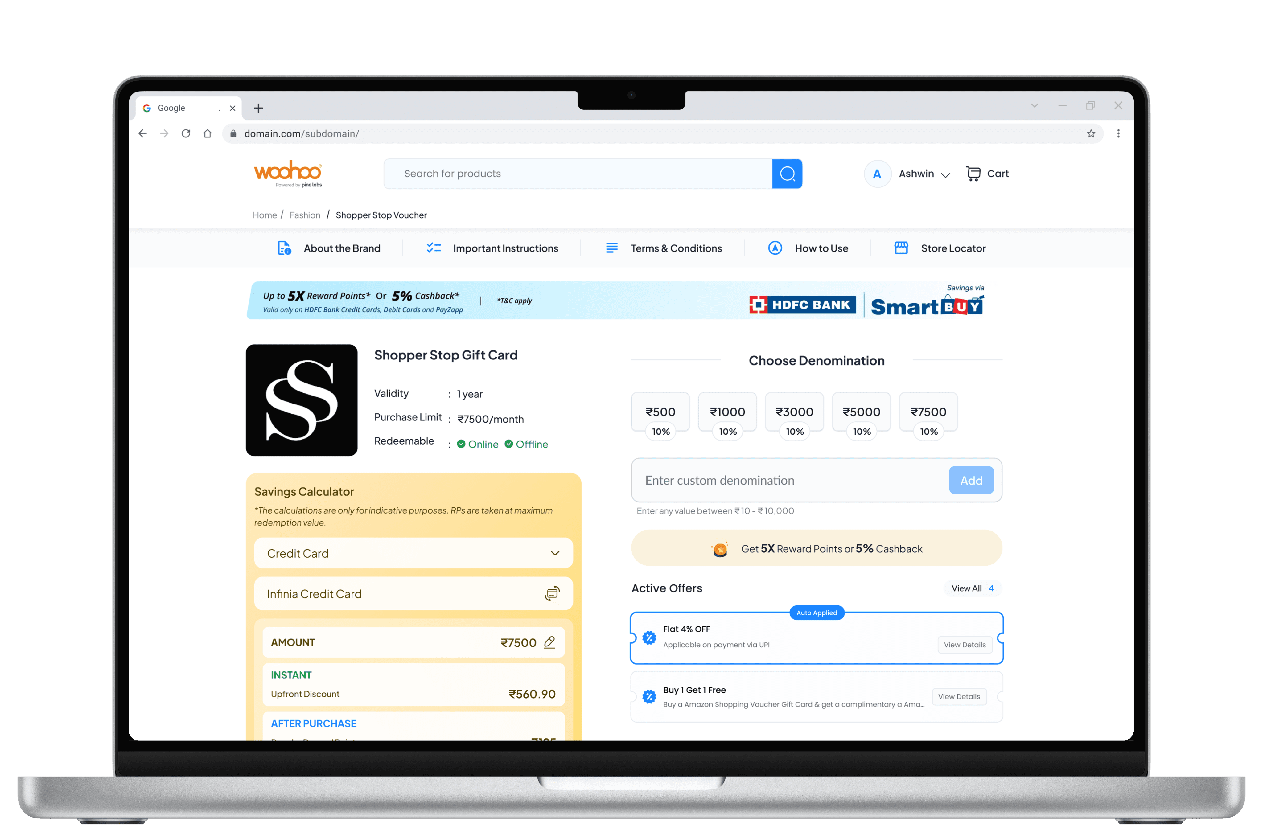
↑
35% desktop conversion
↓
60% bounce rate
↑
25% average order value
04. White-Label Adaptability
Default Woohoo (Blue)

Default Woohoo (Blue)

Default Woohoo (Blue)

06
Delivery & Engineering Handoff
How we partnered with the technical engineering teams to deliver modular design specs and slash dev cycle times.
Engineering Feedback Loop
Sprint-aligned Design
Design delivered exactly 1 sprint ahead of engineering. Weekly feasibility checks with the developer leads ensured technical validation was completed upfront.
Component-first Approach
Design components mapped directly to engineers’ front-end library assets. Drastically minimized back-and-forth revisions by 60% during visual QC.
Edge Case Coverage
Created over 15+ comprehensive loading, error, and empty states. Eradicated post-launch QA bug creep during high-volume server stress periods.
Handoff Process Timeline
1
Figma Specs
2
Documentation
3
Dev Review
4
Implementation
5
Design QA
6
Sign-off
07
Impact & Results
Hard numerical validation demonstrating structural performance uplift, faster white-label turnaround, and direct operating revenue contributions.
↑ 45%
Conversion Rate Improvement
↓ 2.1m
Avg Task Completion Time
↓ 70%
Support Tickets Reduction
< 2 hrs
New Client Deployment
08
Key Learnings
A retrospective analysis of organizational alignments, structural design constraints, and user testing outcomes.
01
Data beats opinions
When executive stakeholders staunchly defended the complex, traditional browsing flows, we launched a rapid A/B sandbox trial with real users. Solid conversion metrics settled the debate quickly. Build your performance testing frameworks early.
02
Scope tokens, not features
Our white-label framework succeeded because we rigorously constrained customization down to exactly 4 parameters. Resisting the urge to make every button customizable drove rapid developer adoption.
03
Design for edge cases first
Documenting loading delays, empty filters, and failed payment loops before writing visual components saved immense developer hours. Shifting validation left is the ultimate safeguard.
04
Sell the savings, not the card
The definitive conversion lift was unlocked by reframing the interface around instant savings rather than catalog gift cards. Consumers seek value. The card is merely the vehicle.